Psychological Interface Design
- How the UI Map works
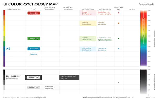
The UI Color Psychology Map has two parts, greys at the bottom and colors at the top. In the greys, when you build on whites with dark contrast, you’ll be in the zone of positive comfortable emotions, with a strong ability to draw users’ eye. The top color chart follows the wavelength, up from 400-700 nanometers. It doesn’t include non-spectral colors, so there are no browns, pinks, or red-violets. There are just a few parts of the color spectrum that are best for grabbing attention. The cool blue zone is a good space for positive feelings with decent salience, and a comforting general-purpose feel. Blue-green (turquoise) is a great color for drawing attention plus it comes with comforting associations. The hot colors are better for grabbing attention and raising salience.
- Calibrating a color hierarchy
Using the color map like a literal hierarchy. Cranking up the salience means moving closer to top red, while turning down the salience means moving towards bottom cool colors, and then down to the grey zone. Since the colors don’t follow a perfect linear progression from low to high arousal, we normally force the colors into a visual hierarchy. In other words, we tweak the shade, saturation, etc. Till red dominates all other colors, green outranks blue, and all accent colors draw more attention than the greys.
- How we build color systems
In most cases we prefer to start with a white background, add grayscale structures, and then add accent colors on top. For the greyscale palette, I prefer to build on a black, white, and grey structure, with a good aesthetic feel. Next, I’ll work on finding ballpark accent colors that have distinct contrasts, appropriate emotional associations, and symbolic meanings. I use the UI Color Psychology Map to think through some of the competing design goals and challenges. Once we rough-out the color system, Rena uses AA and AAA contrast ratio tools to calibrate the palette, while testing its performance under various design conditions. It’s a lot of work. But if it’s done well, you’ll have a robust color system that will serve you for years to come.
- Accessible colors
You may have noticed that my default traffic-light inspired color palette is a problem for some color-blind people. We have a dilemma, as the worldwide use of traffic-light colors makes it an attractive choice for boosting cognition, but an insensitive choice for some color-blind users. The UI Color Psychology Map will help you spot where your palette is least accessible. I’ve marked the most prevalent color-blindness zone covering red-green that affects 7-10 % of men, and many forms of color blindness are in this area, so it’s a bit of a danger-zone. Once you know where your problems exist, you’ll be able to do something about it. Treat this color-blindness zone with sensitivity, by reducing the number of colors, and ascribing fewer cognitive associations to there colors. If you want to build in the danger zone, you’ll at least know where your problem exists, so you can find workarounds to boost your accessibility, like modifying contrast ratios, adding symbols, etc. At the end of the day, you need to test your design against multiple criteria, with accessibility being one of the top priorities.
https://www.alterspark.com/color-psychology/ui-color-psychology-map