Eight Golden Rule- Design Dialog to Yield Closure
Untuk membuat sebuah desain user interface tentunya kita memerlukan pedoman untuk membuat desain tersebut mudah digunakan dan menari untuk pengguna. Eight Golden Rules adalah salah satu panduan utama dalam perancangan User Interface Design yang diusulkan oleh Ben Shneiderman dalam bukunya yang berjudul “Designing the User Interface”.
Salah satu aturan dari 8 Golden Rules adalah Design to yield closure yang berada pada poin nomor 4. Urutan sebuah tindakan atau kegiatan yang dilakukan ketika kita mengerjakan sesuatu pasti ada tahap awal, tengah dan akhir. Ketika tahap akhir, biasanya kita membutuhkan sebuah tindakan balik dari aplikasi untuk menunjukkan jika sebuah hal yang kita lakukan sudah selesai. Begitu pula maksud dari poin ke empat ini adalah untuk memberikan kenyamanan pada pengguna berupa feedback ketika pengguna telah selesai melakukan sesuatu pada halaman kerja. Contohnya ketika kita men-submit tugas di binusmaya maka akan muncul pop up interface dengan tulisan “tugas telah di disimpan” ini akan membuat pengguna merasa lebih pasti jika ia telah melakukan sesuatu yang benar dan telah disimpan dalam sistem. Ini berarti jalan kedepannya lancer untuk mempersiapkan hal yang selanjutnya. Group of action untuk diambil satu demi satu dan pada akhirnya jelas beberapa desain dialog untuk memberitahu bahwa Anda telah selesai dengan sukses atau anda telah melakukan sesuatu yang salah. apa pun kasus yang ada sehingga dialog desain menghasilkan lebih dekat sehingga pengguna dapat memperoleh gagasan bahwa apakah serangkaian tindakan apa pun yang telah mereka lakukan, apa status akhir dan sesuai jika status positif operasi telah berhasil diselesaikan kemudian pengguna dapat pergi untuk serangkaian tindakan selanjutnya.
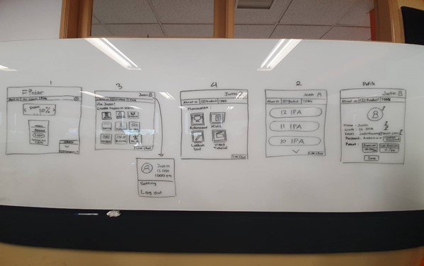
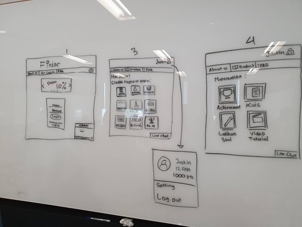
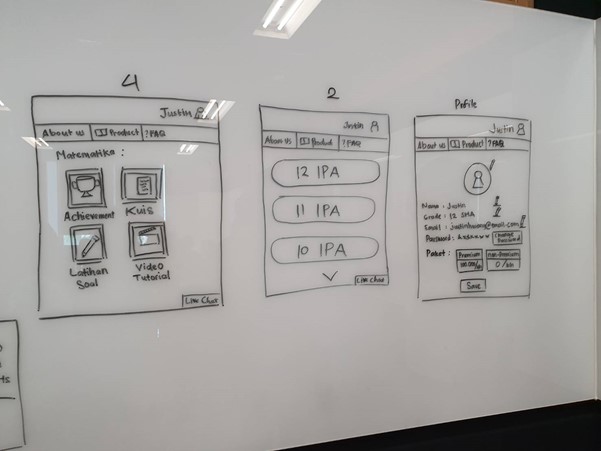
Berikut adalah tampilan user interface website aplikasi bimbel online kelompok kami :
Develop good gui
before, making a good GUI we must pay attention to 7 things
- Light comes from the sky
- Black and white first
- Double your whitespace
- Learn the methods of overlaying text on images
- Make text pop — and un-pop
- Only use good fonts
- Steal like an artist
Shadows are invaluable cues in telling the human brain what user interface elements we’re looking at. This is perhaps the most important non-obvious thing to learn about UI design: light comes from the sky. Light comes from the sky so frequently and consistently that for it to come from below actually looks freaky. When light comes from the sky, it illuminates the tops of things and casts shadows below them. The tops of stuff are lighter, the bottoms are darker.
Designing in grayscale before adding color simplifies the most complex element of visual design– and forces you to focus on spacing and laying out elements. UX designers are really into designing “mobile-first” these days. That means you think about how pages and interactions work on a phone before imagining them on your zillion-pixel Retina monitor.That sort of constraint is great. It clarifies thinking. You start with the harder problem (usable app on a teeny-weeny screen), then adopt the solution to the easier problem (usable app on a large screen).
hat B&WF forces designers to think about spacing and layout before considering color, and how that’s a good thing. Well, it’s time we talk about spacing and layout. If you’ve coded HTML from scratch, you’re probably familiar with the way HTML is, by default, laid out on the page. Basically, everything is smashed towards the top of the screen. The fonts are small; there’s absolutely no space between lines. There’s a biiit of space between paragraphs, but it isn’t much. The paragraphs just stretch on to the end of the page, whether that’s 100 px or 10,000 px.