Minimizing Complexity on Your UI Design – 2022 UI Design Trend
As one of the UI UX trends for 2022, designers will be expected to reduce the complexity of apps. Designers will have to keep the interfaces clean and intuitive as corporations continue to cram more offers and services inside their apps.
Clean. It’s simple to use. User-friendly. Intuitive. Many people recite this motto, but it is frequently lost in translation. Complexity is to blame. An application’s ability to deal with complexity can make or destroy it. In a mild scenario, a complicated interface can be confusing, and in a severe case, it can utterly alienate the user. However, if you take steps to reduce actual complexity first, then minimize perceived complexity, the consumer will have a positive experience. People will learn the application faster, use it more efficiently, and be happier as a result of reducing complexity in the user interface.
Here are some ways to reduce complexity on your UI design.
Minimize Visual Noise
It’s crucial to reduce “perceived” complexity. Visual noise should be kept to a bare minimum to make an interface appear easier to use. White space and contrast are the two most important strategies for decreasing visual noise. While there should be plenty of white space, there should be as little contrast as feasible. In practice, this means focusing on what matters most and reducing the importance of everything else.
Reduce, Reuse, Recycle
Look for ways to reuse interface components. Because elements are reused, less development time is required, and the user gets a more consistent experience. If a user learns how to complete one task, they can use that knowledge to complete a second task if they do so regularly. Another technique to reduce perceived complexity is to reuse interface components because users will rapidly become familiar with the program and know what to expect from it.
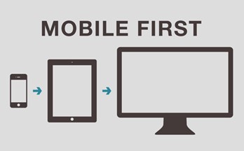
Mobile First

Source : mobile-first.jpg (500×311) (netlifyusercontent.com)
It is a design philosophy that requires developers to think about what matters most in a product or service. Because of the restricted screen real estate available on smaller devices, we had to eliminate any unnecessary elements or functions. Additional features and supporting pieces can be added deliberately as screen real estate grows, but they are not included by default.
Because it avoids the need to shoehorn sophisticated desktop experiences into mobile devices, this method is beneficial for simplifying designs. As a result, the design is more focused on core tasks and content, with less distracting elements, resulting in a better user experience.
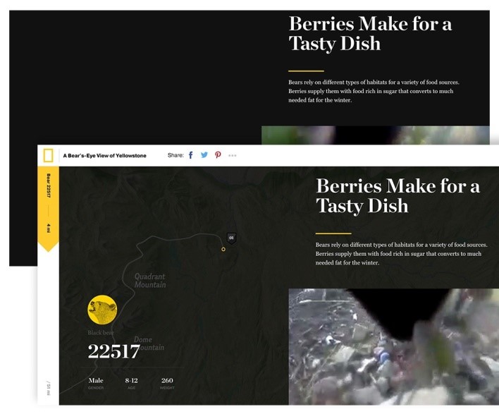
Progressive Disclosure

Source : Reducing Design Complexity. A look at a few helpful strategies for… | by Jon Yablonski | Medium
Progressive disclosure is an interface design strategy in which only the most significant actions or content are displayed by default, while additional features or content are easily accessible. As a result, the interface is more streamlined, which helps users focus their attention by minimizing clutter, confusion, and cognitive burden.
We can do it by utilizing a dropdown, accordion, or toggle to reveal content that is concealed by default. Because it allows us to postpone less important activities, sophisticated features, or additional content to a secondary screen, this method is quite effective for streamlining designs.
Progressive Enhancement

Source : Reducing Design Complexity. A look at a few helpful strategies for… | by Jon Yablonski | Medium
This is a technique that focuses on giving all users access to fundamental information and functionality, then stacking enhancements on top of that for more competent browsers and devices. This pushes designers to emphasize a basic experience that grows more complex only when necessary.
By following the procedures outlined above, you can easily reduce unnecessary complexity in your designs. As a result, consumers will have a better user experience, as they will be able to concentrate on the key information or features.
References :
Minimizing Complexity In User Interfaces — Smashing Magazine
2022: Top 12 UI UX Trends to follow – UIUX Trend
Minimizing Complexity In User Interfaces — Smashing Magazine
Reducing Design Complexity. A look at a few helpful strategies for… | by Jon Yablonski | Medium


