Five Mistakes That People Make Using Axure In Prototyping
Axure is a powerful tool for creating software prototypes quickly. Getting started with Axure is really easy. However, the tool is so intuitive that many users can be productive without undergoing any formal training. What they might not be aware of is that they probably aren’t using Axure optimally. So, there are a few elementary mistakes that beginners seem to make. Here’s a list of these mistakes and, more importantly, how to avoid them
- Using arbitrary sizes
Axure offers you a drawing canvas that’s reproduced at 1:1 pixel size when you export to an image or to an HTML prototype. This means you need to make sure that you set widget sizes in Axure to the accurate pixel sizes that you expect them to have on the finished website.
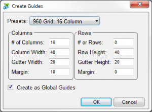
If you use arbitrary sizes, your wireframes might look too large or too small when viewed through a browser, and won’t appear like a realistic prototype of a website. How do you decide what sizes to use? Probably most important thing to define is the page width. A standard width that’s often used is 960 pixels, which makes your wireframes look fine on a minimum 1024×768 screen resolution. To make sure your page fills these 960 pixels and goes no further, you can use the ‘Guides’ feature in Axure to create a global guide.
Axure can do this automatically for you, as well as creating extra column guides to help you come up with good proportions on your wireframes. This is done through the ‘Wireframe > Grid & Guides > Create Guides’ dialog:
- Adding unnecessary text panels
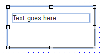
When you start wireframing a page, you’ll soon come up with the need to put some text inside a box. One way to do this in Axure is to drag 2 widgets into your page: a rectangle and a text panel.
While there’s nothing inherently wrong about this, now you have 2 objects to worry about. You need to ensure that they’re moved & re-sized together, and you’ll have to group them to make sure this happens automatically. In most of these cases, there’s a simpler solution.
Axure allows you to add text inside most widgets, including Rectangles, Placeholders, Button shapes and even images without the need to create a separate text panel. All you need to do is double-click on the widget you want to add text to, and you’ll see a cursor that allows you to enter text. On image widgets, double-clicking sets the image, so you need to right click and select ‘Edit Image > Edit Text’ instead. To get the text in the right place inside the rectangle, you’ll probably need to use the widget properties panel to adjust the horizontal/vertical alignment and the padding.
- Using dynamic panels for simple interactions
Dynamic panels are a powerful tool, and they allow you to make any part of the page have multiple states. However, there are a few simple things that you can accomplish without having to deal with the complexities of dynamic panels:
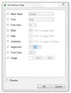
If you want an object to have a hover state or selected state with different formatting (e.g. bold and highlighted), you don’t need to use a dynamic panel. Instead, you can right-click on the object and select the ‘Edit button shape > Edit Rollover/Mouse Down/Selected/Disabled Style’ options. Axure will then show you a dialog where you can specify the formatting changes that you want for each state.
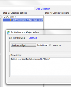
If you just want the text on a widget to change as part of an interaction, you also don’t need to set up a dynamic panel with the widget in different states. You just need to select the ‘Set Variable/Widget value(s)’ from the actions list when you define an interaction.
- Leaving widgets and dynamic panels un-labelled
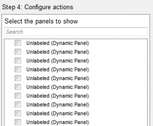
When you add to the page a widget or dynamic panel whose state you’re planning to modify later on through some interaction, you should immediately try to give it a descriptive name. Otherwise, when the time comes to define your interaction, you’ll be faced with a long list of ‘Unlabeled’ items, and you won’t have any way to find the one you want to interact with:
Axure also gives you a summary of interactions in “human readable” language. Using descriptive widget names means that this summary will be easy to read and understand, as in the following example:
- Forgetting to keep previous versions
Although, Axure has got an ‘Undo’ feature like most other design tools, it’s sometimes easy to make subtle mistakes (such as deleting a part of your page) that you won’t notice until much later. Also, people who review your wireframes might ask you to make some changes but later change their mind and ask you to revert to an earlier version.
If you’re making drastic changes to a page, it’s usually worth using the ‘Duplicate page’ feature to create a copy of that page that you can keep as a backup. You can also keep regular copies of the entire Axure (.rp) file, for example a copy every day or before each significant design iteration.
However, the best way is to use the Axure ‘Shared Projects’ feature – even if you’re not working in a team and need to share your project with others. When you’re managing your project as a shared project, Axure automatically keeps a copy of the previous version every time you press ‘Check In’. To access these earlier versions, go to the ‘Share’ menu and select ‘Browse Shared Project History’. You’ll be given the option to pick a previous version and export it into an independent Axure file, so you can see what your project looked like earlier in time, and copy things that you might have since changed or deleted.
References
Baxevanis, A., 2012. 5 Mistakes People Make Using Axure. [Online]
Available at: https://www.webcredible.com/blog/5-mistakes-people-make-using-axure/
[Accessed 3 May 2017].


