Where should we start to learn basic UI / UX ?
What is UX? UX is a user’s experience with a system, e.g. websites, mobile apps, etc. Nowadays, Human-Computer Interaction (HCI) design is more popularly known as UI/UX. UX addresses all aspects of a service from the perspective of the customer. It essentially guides the interaction of the customer with mobile apps and website from both a visual and functional perspective. UX is what people experience on your site and it’s important because users remember experiences more than functional stuff (Eng, 2015) :
- 68% of users leave a website because of poorly designed UX
- 44% of online shoppers will tell friends about a bad experience of poor UX website
- 62% of customers repeat their purchase if UX is great
These could be concluded that good UX design should ensure that people hang around longer on your website, increasing your user and, in the case of e-commerce websites, increasing the chance of someone making a purchase and recommending your website to others. UX is so important for companies that implements their business on website. By just entering the terms “UI/UX design” into Google Search, we’ll find many articles showing sure-fire ways to get certified or online courses that we should join.
There are key reasons why we should pick up basic UX/UI design (Lou, 2016) :
- Learning basic UX/UI design is not expensive (in time and money).
- Getting to directly influence how the product shapes up.
- Getting to be a lot more agile to make changes on the fly.
- Understanding our customers a lot better over time.
Nowadays, in business tech startups need someone who knows the basic UX/UI design. So, these are some tips, resources, and tools that can be used to turn the UX ideas into a high-fidelity prototype.
- Using Sketchapp or Photoshop/Illustrator
You can download Sketchapp (for Mac users) or Photoshop/Illustrator (for non-Mac users). Using Sketchapp or Photoshop/ Illustrator to familiarize yourself with the key tools that you will be using to build your layouts. Many of the world’s best apps are also designed with Sketchapp, which is super-friendly for non-technical people in general. On Sketchapp, there is feature named sketch-mirror where you are able to see your exact design onto your phone itself and can be live editing.
- Getting inspiration through research
You can also download familiar material designs (fancy word for templates) and UI kits that you can easily drag and drop together to form your very first app or website design. For example, you search some referenced other apps out there to get a feel how was it currently done and how we could simplify it further. The other way is of course to simply visit Google images and type in “best app designs” and implement it in your colours and styles. There are also communities on Dribbble and Behance, where you can learn from designers who are on top of the latest trends in tech and mobile design. However, beware of analysis paralysis, as you may find yourself stuck, scrolling through the many designs thinking how you pale in comparison to them. Just stop, and get straight into execution.
- Making prototype and testing your design with users
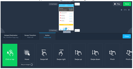
Depending on the level of detail you want your prototype app to function, you can try out a suite of different software to meet your needs. It can be as simple as Marvelapp, POP, or InVision, where it gets you the simple basic layers and selecting clickable areas.Or you can try the more advanced Principle and Pixate, where you can get styles and UX elements that are more fancy, like bouncing, loading, folding etc.
Take this prototype into the streets to speak with at least 10 real customers, observing how they interact, and if they even understand how the screens work to begin with. This is where you can iterate quickly based on feedback.
A rule of thumb to follow:
“User interface is like a joke, if you have to explain it, it’s not that good.”
4. The design handoff to developers
This is where you have almost finalized your design, and it’s ready to be fleshed out. We believe in building our app in-house, where we work with our own mobile developer to execute the styles and designs.
A very good tool is Zeplin, which allows to export the artboards from plugins, and the elements, colour codes, and notes for the developer to reference from to build. It’s really amazing, and many other startups that use such software to accelerate their workflow and productivity.
Please be caution that you should refrain from making any more changes once the handoff is complete. Otherwise, it’s going to waste a ton of effort for the developer to make changes – designers moving some pixels may mean hours of code and styling adjustments for developers.
Bibliography
Eng, B. (2015, August 09). Why UX matters (Infographic). Retrieved October 31, 2016, from Tech In Asia: https://www.techinasia.com/talk/ux-matters-infographic
Lou, K. (2016, September 13). Non-technical founders should learn basic UI/UX. Here’s where to start. Retrieved October 31, 2016, from Tech In Asia: https://www.techinasia.com/talk/nontechnical-founders-learn-basic-uiux-start


