Eight Golden Rule : Reduce Short Term Memory Load
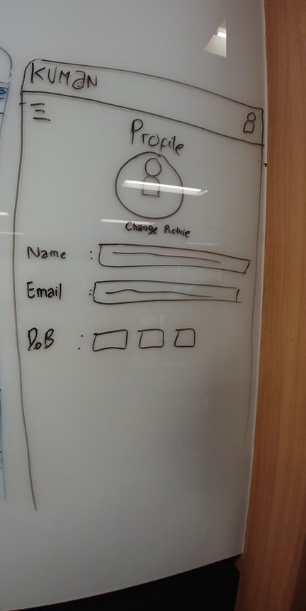
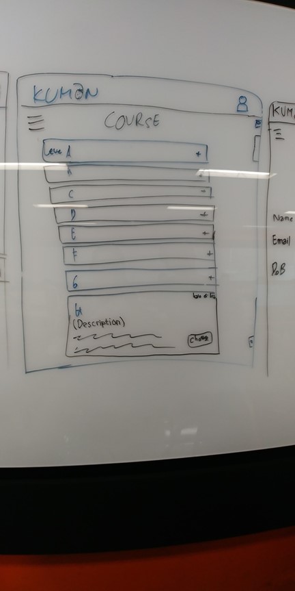
Reduce short term memory load is one of the 8 golden rules of User Interface Design. A famous study suggests that humans can store only 7 (plus or minus 2) pieces of information in their short term memory. You can reduce short term memory load by designing screens where options are clearly visible, or using pull-down menus and icons. As Nielsen says, recognizing something is easier than remembering it. Minimize the user’s memory load by making objects, actions, and options available. The user should not have to remember information from one part of the dialogue to another. Instructions should be visible. Use iconography and other visual aids such as themed coloring and consistent placement of items to help the returning users find the functionalities.
Reduce memory load:
· App has a clear structure
· “Recognition over recall”
· Implicit help
· Visual aids
Human attention is limited and we are only capable of maintaining around five items in our short-term memory at one time. Therefore, interfaces should be as simple as possible with proper information hierarchy, and choosing recognition over recall. Recognizing something is always easier than recall because recognition involves perceiving cues that help us reach into our vast memory and allowing relevant information to surface. For example, we often find the format of multiple choice questions easier than short answer questions on a test because it only requires us to recognize the answer rather than recall it from our memory. Jakob Nielsen, a user advocate who’s been called one of the “world’s most influential designers” by Bloomberg Businessweek has invented several usability methods including heuristic evaluation. Recognition over recall is one of Nielsen’s ten usability heuristics for interface design.
In a good user interface, visual information is very important because the user can comfortably use the application without having to remember the flow he needs to do by memorizing portions of the screen.
You must provide visual information assistance in the form of information in text and also with the help of unique & memorable icons for the application that are helping the users to easier for understanding the application.
A good user interface design is a user interface that is not troublesome, informative but still enjoyable to be seen by the user. These Eight Golden Rules from Schneider ensure a good design but can ease the burden experienced by users in using applications that we make.


