Design Tools and Websites that are Godsends for UI Design and Trends that Will Shape Web Design in 2017
Internet is an extremely creative space, where design, technology, and development strategies evolve rapidly. Due to the advancement of technology, website and its design get more popular day by day. The reason behind this is that people are aware from the importance of a website and its usage. Website refers to the place where the products and its related information are displayed to educate customers about the services.
The ultimate objective of the website or its design is to attract large number of audience and convince them to support the services. Thus, to fulfill this objective, people design the website in such a way that it easily convinces the targeted audience.
While designing a website, our mind is thinking about the following things:
- Website elements like text, graphics, and more
- Placement of website elements
- Targeted audience type and behavior
- Color theme used in the website
- Relevance of website objects like textual information include in the website and more
Today, we can easily see the advancement in website and its design. Several design tools have had a positive impact on usability and user experience. This has provided great convenience not only for users but also for designers. Today I’m talking about recommended new tools on the internet and the web design trends for 2017. Now, let’s have a look!
The web design trends for 2017:
- Clever use of bold font and white space
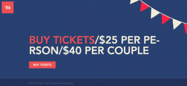
Less is more.” This phase effects the visitors who come to the website. They will see bold, outstanding fonts that immediately capture their attention. Increasingly, designers are making use of bolder fonts and fewer words to make more concise and powerful statements. The design of the landing page will be such that the concise message will “pop.” Here are some examples:
- Use of bright colors and gradients
If you have noticed that more companies are using bright colors and gradient patterns in
their logos. Some examples of logos include Instagram, Hyperlapse, and Boomerang.
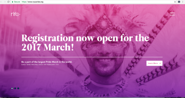
Some examples of websites include: Pretty eye-catching, right?
NYCPride.org
- Flexbox
The Flexible Box as known as the Flexbox is an efficient and clever method to distribute and align digital space in a container, even when the size of the space is unknown. This means that when you are viewing content on mobile, the content will not appear weird even if it is dynamic. The flexbox container will automatically expand or shrink the content proportionately to the available space or make them smaller to prevent overflow. The method can now be used seamlessly with all modern browsers. It now responds to browser window changes quickly.
- Increasing use of bots for conversation
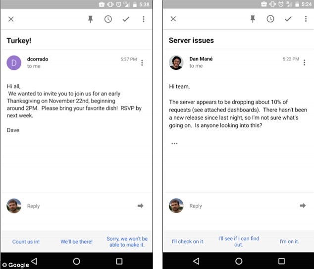
The trend of designers using bots or artificial intelligence (A.I) for conversation will continue in 2017. These bots behave rather similarly as human beings. This trend is not just perceived over mobile in places such as Facebook M, it is also seen increasingly via email through functions like Google Smart Reply.
The new tools on the internet for designing UI
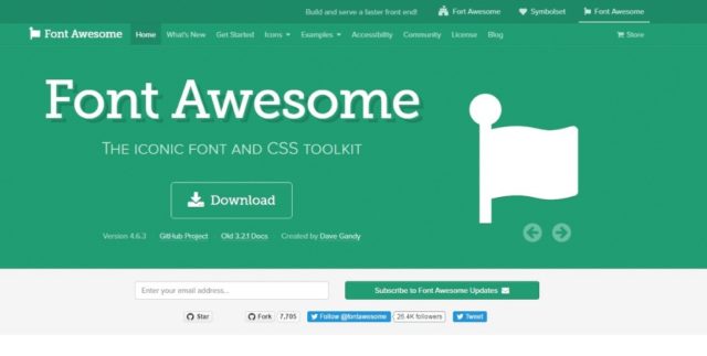
Font Awesome gives you scalable, vector icons that can instantly be customized—size, color, drop shadow, and anything that can be done with the power of CSS.
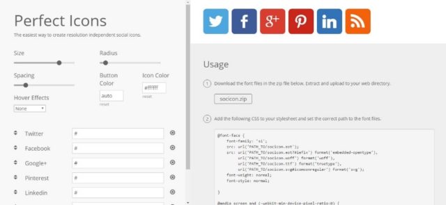
Perfect Icons is an easy tool to create resolution-independent social icons.
Freebiesbug is a website that offers abundant useful resources about web design 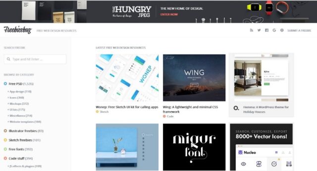
including various kinds of resources about templates, UI, and plug-ins.
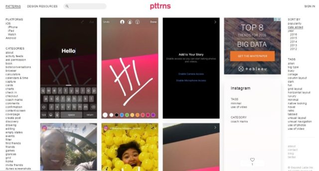
Mobile design patterns and UI resources like UIKit and UI elements are available on
Pttrns for designers.
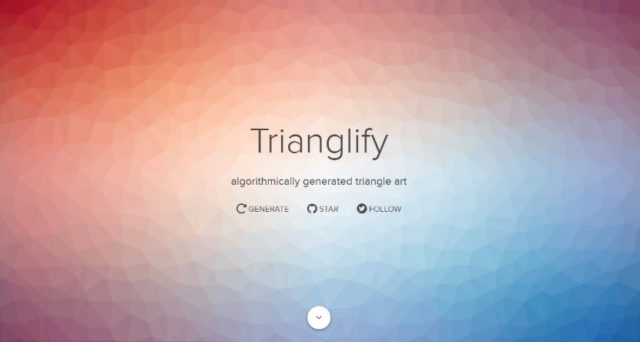
Trianglify is a tool to generate beautiful triangle materials and background of SVG and CSS.
Lack of inspiration? Don’t know how to use websites? Site Inspire can be a good assistant for you to confront this problem. It can also filter materials for you according to different categories, platforms, and styles.


